Single Course EDA
1 Introduction
This document contains sample code to: connect to Canvas using the rcanvas package (Ranzolin, Hua, and Hathaway 2021), retrieve grade books, wrangle them into shape, and perform some initial exploratory data analysis (EDA) (Tukey 1977).
The rcanvas package provides an R interface to retrieve a class list and grade books for individual classes. The code below illustrates one way to establish a safe connection to Canvas, generate a class list, wrangle the data into a useful shape (Wickham 2021), and look at trends in the scores (Wickham et al. 2020; Patil 2021). First we will load the necessary libraries.
2 Preliminaries
Often times, 80% of data analysis involves setting up the environment and data wrangling. That is not so different in this case.
2.1 Load Libraries
# Safely store credentials
library(keyring)

# Read canvas course information
library(rcanvas)

# Data wrangling and formatting
library(tidyverse)
library(kableExtra)
library(knitr)
opts_chunk$set(comment=NA, prompt=FALSE, cache=FALSE, echo=TRUE, results='asis')

# Plotting
library(ggplot2)
library(ggstatsplot)
library(qqplotr)

# stats
library(rstatix)
library(easystats)
library(summarytools)
st_options(bootstrap.css     = FALSE,       # Already part of the theme so no need for it
           plain.ascii       = FALSE,       # One of the essential settings
           style             = "rmarkdown", # Idem.
           dfSummary.silent  = TRUE,        # Suppresses messages about temporary files
           footnote          = NA,          # Keeping the results minimalistic
           subtitle.emphasis = FALSE)       # For the vignette theme, this gives better results.
                                            # For other themes, using TRUE might be preferable.
2.2 Establish Connection to canvas
Connecting to Canvas requires an access token. As described in the rcanvas documentation, to establish an access code, sign into canvas and go to: Canvas -> Account -> Settings -> Approved Integrations -> Add new token
The token is then added as an argument to the set_canvas_token() argument. It is unwise to hard code an API token into the code. One option is to rely on the rstudioapi::askForPassword() function. The function rstudioapi::askForPassword("Canvas API Token") is assigned to a variable and passed to set_canvas_token(). Another option is to use the keyring library, store the credentials, and then call them. Following instructions provided at RStudio, the latter appraoch is employed here.
Connecting to canvas also requires setting the Canvas domain. This is done with the set_canvas_domain() function. With the token and domain set, it is possible to pull up a class list. The full class list table contains way more variables than are useful at this stage. Below, the key variables, class name, and id are selected and output as a table. This is done using a pipe which does not store the object in a variable or permanently alter it in any way.
# Enter token, set domain, and get class list
canvas_token <- key_get("canvas-token", "nmc")
set_canvas_token(token = canvas_token)

#Set domain
set_canvas_domain("https://nmsu.instructure.com")

# Get course list and eliminate unnecessary columns
get_course_list() %>%
  select(id, name)
3 Select Class and Get Master Grade Book
For this sample, I’ve chosen “1273540 2020 Spring - ANTH-125G-M02-INTRO WORLD CULTURES.” With the class selected, one can use the get_course_gradebook() function to pull the grade book for the class. Note that it takes quite some time to pull the master grade book, and at least in my case it contains several hundred columns. Given that it takes so long to pull down the grades, and the table requires a bit of wrangling, I suggest saving the master grade book to a variable that can be called up without having to reload from the server.
To perform the analysis on a different class, just insert the id that corresponds to the desired course. Provided that assignments are named consistently, most the code will not need to be changed. This facilitates quickly generating reports across different classes.
# Loading the grade book is pretty slow.
# Assign grade book to a variable.
gb_all <- get_course_gradebook(1273540)
3.1 Remove Unwanted Columns and Inspect Others
At least in my case, the institution has subscribed to Turnitin. After the subscription to Turnitin, the master grade book for recent courses contains over 500 columns. All but about 32 of these columns are part of Turnitin and not of much interest for EDA of grades. In fact, the first couple of times I looked at the master grade book with all of the columns, I couldn’t find the most important one–the grades for individual assignments. I found that identifying useful columns was much easier once the hundreds of Turnitin columns were removed.
Older classes, before Turnitin was added don’t have as many columns. However, running these lines of code below to strip out Turnitin columns isn’t a problem.
# The raw gp contains many 'turnitin_data' cols,
# remove these to help see cols of interest.
gb <- gb_all %>%
  select(-starts_with("turnitin_data"))

# Get list of col names
colnames(gb)
[1] “id” “body”
[3] “url” “grade”
[5] “score” “submitted_at”
[7] “assignment_id” “user_id”
[9] “submission_type” “workflow_state”
[11] “grade_matches_current_submission” “graded_at”
[13] “grader_id” “attempt”
[15] “cached_due_date” “excused”
[17] “late_policy_status” “points_deducted”
[19] “grading_period_id” “extra_attempts”
[21] “posted_at” “late”
[23] “missing” “seconds_late”
[25] “entered_grade” “entered_score”
[27] “preview_url” “attachments”
[29] “user.name” “grades.final_score”
[31] “course_id” “assignment_name”
3.2 Create Anon ID and Select Necessary Columns
Student names and ID’s are contained in the master grade book. For purposes of the Family Educational Rights and Privacy Act (FERPA), it is critical to ensure student anonymity. Therefore, student names and ID’s must be removed. The code below strips white space out of the assignment names and constructs an anonymous ID.
Canvas also creates a "test student’ and this individual needs to be removed or it will modify results in unwanted ways. Additionally, if students didn’t take a quiz or exam and a 0 was not manually filled in one needs to be added. Lastly, assignment names are turned into a factor.
# Remove whitespace from assignment names
gb$assignment_name <- gsub('\\s+', '', gb$assignment_name)

# Create anonymous ID, select cols of interest, and
# drop na's associated with 'test student'
gb <- gb %>%
  mutate(anon_id = str_c(
    str_sub(user.name, -3), str_sub(user_id, -3))
    ) %>%
    select(anon_id,
           assignment_name,
           score,
           course_id) %>%
  filter(anon_id != 0) %>% # Remove Test Student
  mutate_all(~replace(., is.na(.), 0)) %>% # Replace NA with 0
  mutate(assignment_name = as_factor(assignment_name))
3.3 Filter Syntax for Assignments
The grade book is in “narrow” rather than “wide” format. If the quizzes and assignments are named properly, it is a simple matter to use a very basic regular expression to filter on the classes of items that are of interest. Such filters can be included in pipelines for various kinds of analyses or or graphing operations.
# Get Exams
gb %>% filter(str_detect(assignment_name, "^Exam"))
# Get quizzes
gb %>% filter(str_detect(assignment_name, "^Quiz"))# Get films
gb %>% filter(str_detect(assignment_name, "^Film"))# Remove quizzes but keep all others
gb %>% filter(str_detect(assignment_name, "Attendance$", negate = TRUE))3.4 Get Assignment Counts
Some kinds of analyses require a consistent number of items across various data collection events (Exams, Quizzes, etc). The function below is a really easy way to count the number of items in each instance of a type of assignment. In this case, there are three exams: Exam1, Exam2, and Exam3. Using a regular expression to pull up all exams and summarizing a count shows how many grades are recorded for each exam. If there are irregularities, these can be examined using the View() function.
gb %>%
  filter(str_detect(assignment_name, "^Exam")) %>%
  group_by(assignment_name) %>%
  summarize(count=n())
3.5 Prepare Data and Create Attendance Score from Daily Attendance Quizzes
I take attendance by using very brief attendance quizzes at the start of class. This automates the process of people marking themselves present. A Cumulative Attendance score can be created by adding up the sum of each day’s attendance quiz. In addition to being well suited for regression analysis performed below, having data in a “wide” format is a convenient way to sum across each day’s attendance score to generate a Cumulative Attendance. The tidyverse function pivot_wider() was used for this task. Below the data are pivoted to wide format and the column numbers are retrieved.
gb_wide <- gb %>%
  pivot_wider(names_from = assignment_name, values_from = score)
colnames(gb_wide)
[1] “anon_id”
[2] “course_id”
[3] “Exam1”
[4] “Exam2”
[5] “Exam3”
[6] “01Jan23Attendance”
[7] “02Jan28Attendance”
[8] “03Jan30Attendance”
[9] “04Feb4Attendance”
[10] “05Feb6Attendance”
[11] “06Feb11Attendance”
[12] “07Feb13Attendance”
[13] “08Feb18Attendance”
[14] “09Feb20Attendance”
[15] “10Feb25Attendance”
[16] “11Feb27Attendance”
[17] “12Mar3Attendance”
[18] “13Mar5Attendance”
[19] “14Mar10Attendance”
[20] “15Mar12Attendance”
[21] “18Mar31Attendance”
[22] “19Apr2Attendance”
[23] “20Apr7Attendance”
[24] “21Apr9Attendance”
[25] “22Apr14Attendance”
[26] “23Apr16Attendance”
[27] “24Apr21Attendance”
[28] “25Apr23Attendance”
[29] “26Apr28Attendance”
[30] “27Apr30Attendance”
[31] “28May5Attendance”
[32] “29May7Attendance”
[33] “30May12Attendance”
[34] “Film1Activity:MotherTongues”
[35] “Film2Activity:TheHunters”
[36] “Film3Activity:TheAxFight”
[37] “FilmActivity4:FirstContact”
[38] “FilmActivity5:AdvertisingMissionaries” [39] “Quiz1”
[40] “Quiz2”
[41] “Quiz3”
[42] “Quiz4”
[43] “Quiz5”
Once pivoted wide, using the index location determined above, a sum is calculated across all of the Attendance Quiz columns and then each of the individual quizzes are dropped. Now the data are in wide format with each exam in its own column along with a Cumulative Attendance score.
gb_wide <- gb_wide %>%
  mutate(attendance = select(.,7:34) %>%
           rowSums(),
         .after = course_id) %>%
  select(.,-(7:34))
On the wide data frame, the same approach can be used to get a grand total
gb_wide <- gb_wide %>%
  mutate(grand_total = select(.,3:16) %>%
            rowSums()
          )
4 Data Summary and Visualization
Pulling up the summary values is a good place to start.
gb_wide %>%
  select(attendance, Exam1, Exam2, Exam3, grand_total) %>%
  descr() %>%
  tb() %>%
  kable(format = "html", digits = 2) %>%
kable_styling(bootstrap_options = "striped")| variable | mean | sd | min | q1 | med | q3 | max | mad | iqr | cv | skewness | se.skewness | kurtosis | n.valid | pct.valid |
|---|---|---|---|---|---|---|---|---|---|---|---|---|---|---|---|
| attendance | 79.28 | 14.65 | 26 | 75 | 84.00 | 89.00 | 92.00 | 8.90 | 13.50 | 0.18 | -1.94 | 0.36 | 3.68 | 43 | 100 |
| Exam1 | 110.02 | 16.40 | 69 | 99 | 111.00 | 120.00 | 144.00 | 13.34 | 19.50 | 0.15 | -0.36 | 0.36 | 0.02 | 43 | 100 |
| Exam2 | 114.21 | 30.53 | 0 | 108 | 120.00 | 129.00 | 147.00 | 13.34 | 19.50 | 0.27 | -2.54 | 0.36 | 6.75 | 43 | 100 |
| Exam3 | 108.84 | 29.49 | 0 | 102 | 114.00 | 126.00 | 144.00 | 17.79 | 22.50 | 0.27 | -2.37 | 0.36 | 6.13 | 43 | 100 |
| grand_total | 785.20 | 126.18 | 362 | 757 | 821.25 | 855.75 | 946.75 | 77.84 | 96.08 | 0.16 | -1.76 | 0.36 | 3.06 | 43 | 100 |
5 Graph Results and Identify Outliers
The library ggstatsplot provides a covenant way to report histograms, central tendency, and density curves. Here, ggstatsplot::gghistostats is used to create annotated histograms of the course exams. The rstatix::identify_outliers() function allows easy flagging of outlying scores on each of the exams.
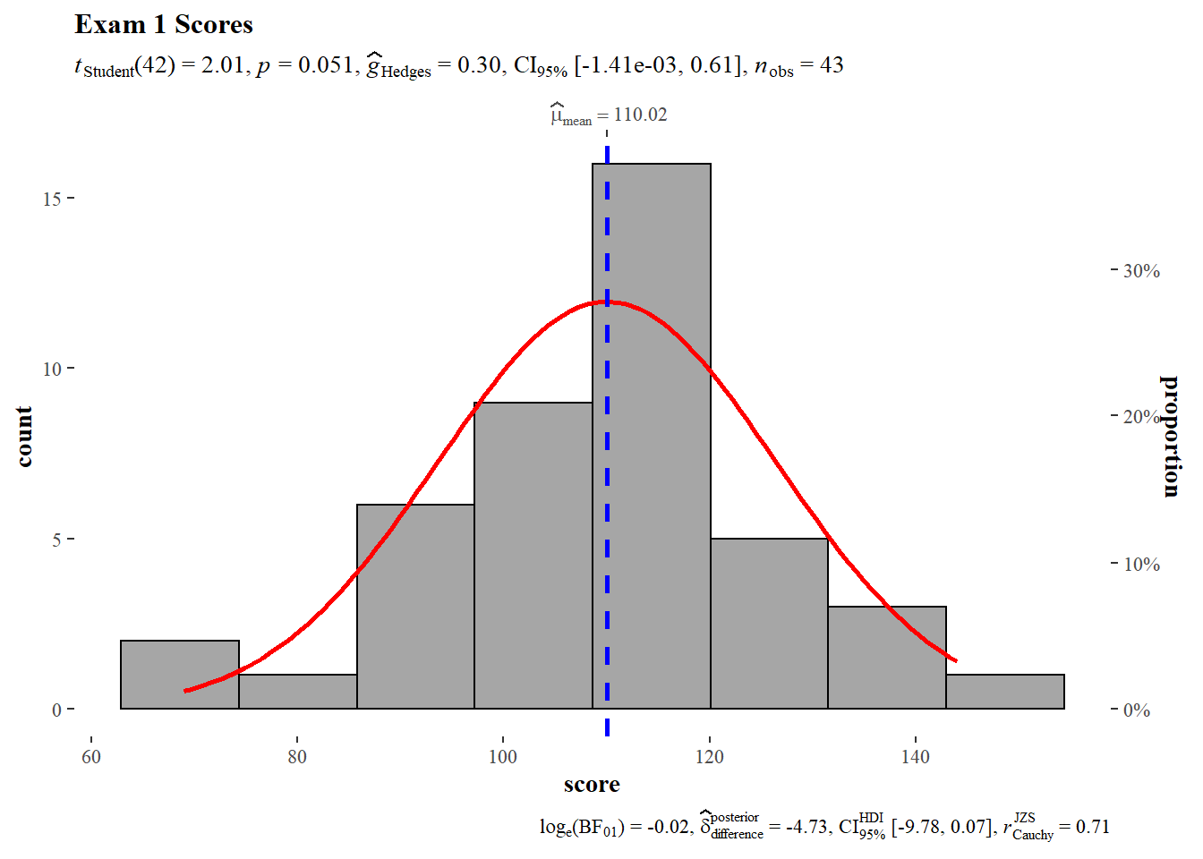
5.1 Exam 1
We begin with a histogram of Exam 1 scores. The gghistostats() function provides a frequentist statistical report at the top and a baysian analysis at the bottom. In this case, the frequentist analysis is a one sample t-test and a Hedges G for effect size estimates with confidence intervals. The test value for the one sample t-test is 112 (150 point exam * 0.75 = 112.5). The one sample t-test null hypothesis cannot be rejected, the sample mean does not deviate significantly from the theoretical mean. Hedges G does not detect any significant size effect.
#Exam 1
gb %>%
  filter(., assignment_name == "Exam1") %>%
  gghistostats(data = .,
             x = score,
             test.value = 105,
             normal.curve = TRUE,
             normal.curve.args = list(color = "red", size = 1),
             ggtheme = ggthemes::theme_tufte(),
             title = "Exam 1 Scores"
             )
The Shapiro-Wilk test provides a quick check to see if scores are normally distributed. Exam 1 scores are normally distributed.
gb %>%
  filter(assignment_name=="Exam1") %>%
  shapiro_test(score)%>%
  mutate(statistic=round(statistic,3)) %>%
  mutate(p=round(p,3))
A quantile-quantile (QQ) plot provides a graphical means to asses whether the distribution is normal. The plot identifies a single individual who is outside of the 95% confidence interval, indicating there is a single outlier.
gb %>%
  filter(assignment_name=="Exam1") %>%
  ggplot(.,aes(sample = score))+
  stat_qq_band() +
  stat_qq_line() +
  stat_qq_point() +
  labs(x = "Theoretical Quantiles", y = "Sample Quantiles")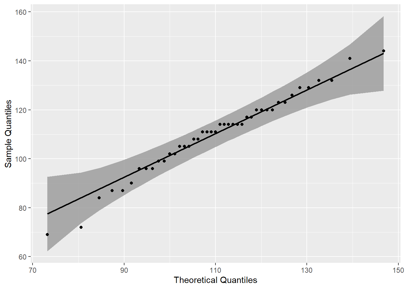
The rstatix identify identify_outliers() function, like the qqplot above, indicates a single outlier. The identify_outliers() function indicates that the outlier is not extreme.
gb %>%
  filter(assignment_name=="Exam1") %>%
  identify_outliers(score)
5.2 Exam 2
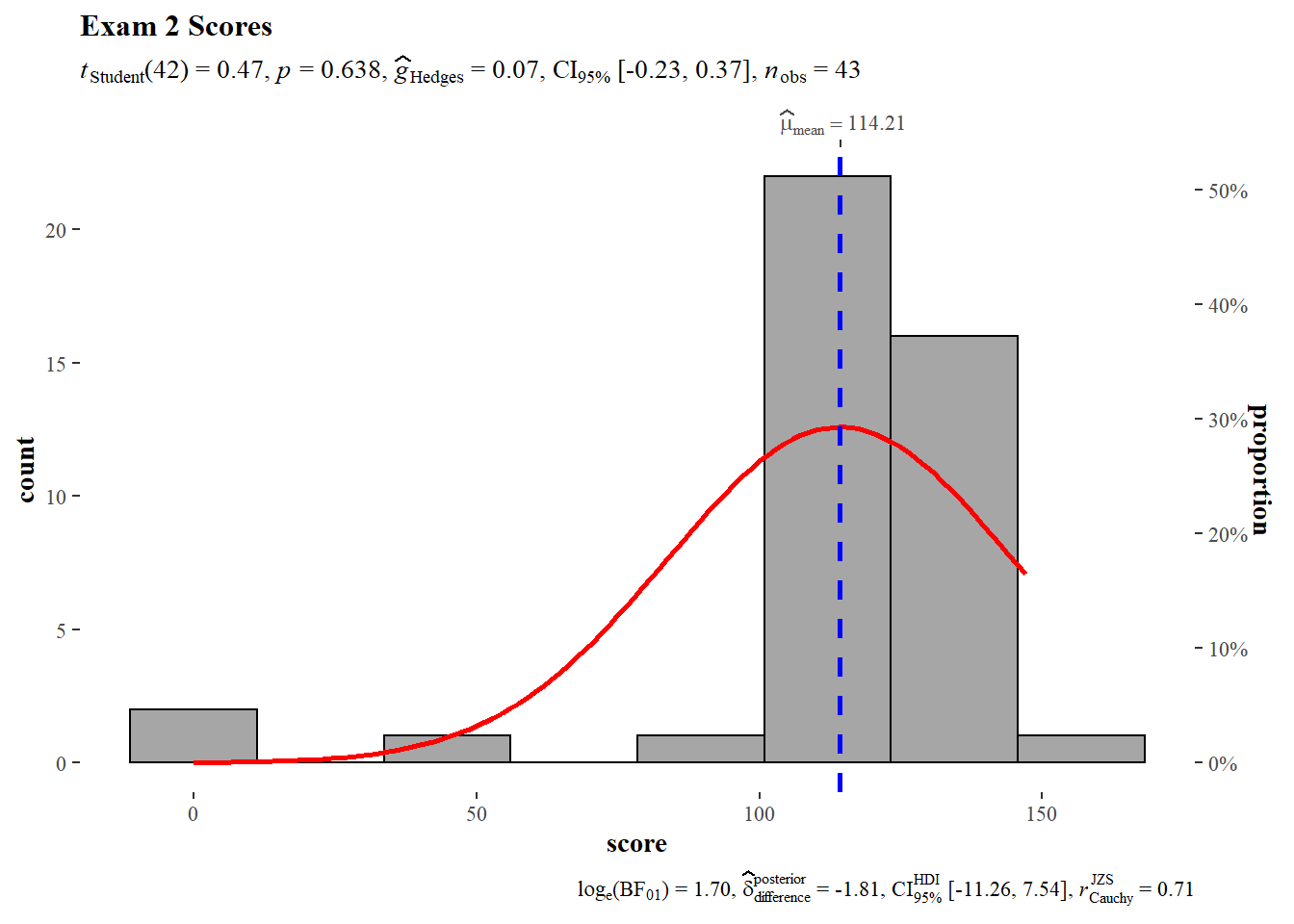
A histogram of Exam 2 shows a negative skew which is consistent with what was reported above in the summary statistics. The same test value of 112 was used. The null hypothesis of the one sample T-test cannot be rejected, the sample mean does not deviate significantly from the theoretical mean. Hedges G does not flag any significant size effect.
# Exam 2
gb %>%
  filter(., assignment_name == "Exam2") %>%
  gghistostats(data = .,
             x = score,
             test.value = 112,
             normal.curve = TRUE,
             normal.curve.args = list(color = "red", size = 1),
             ggtheme = ggthemes::theme_tufte(),
             title = "Exam 2 Scores"
             )
The distribution does not pass the Shapiro-Wilk normality test which is consistent with visual inspection of the histogram above.
gb %>%
  filter(assignment_name=="Exam2") %>%
  shapiro_test(score)%>%
  mutate(statistic=round(statistic,3)) %>%
  mutate(p=round(p,3))
A QQ Plot shows the presence of three outliers that are outside the 95% confidence interval.
gb %>%
  filter(assignment_name=="Exam2") %>%
  ggplot(.,aes(sample = score))+
  stat_qq_band() +
  stat_qq_line() +
  stat_qq_point() +
  labs(x = "Theoretical Quantiles", y = "Sample Quantiles")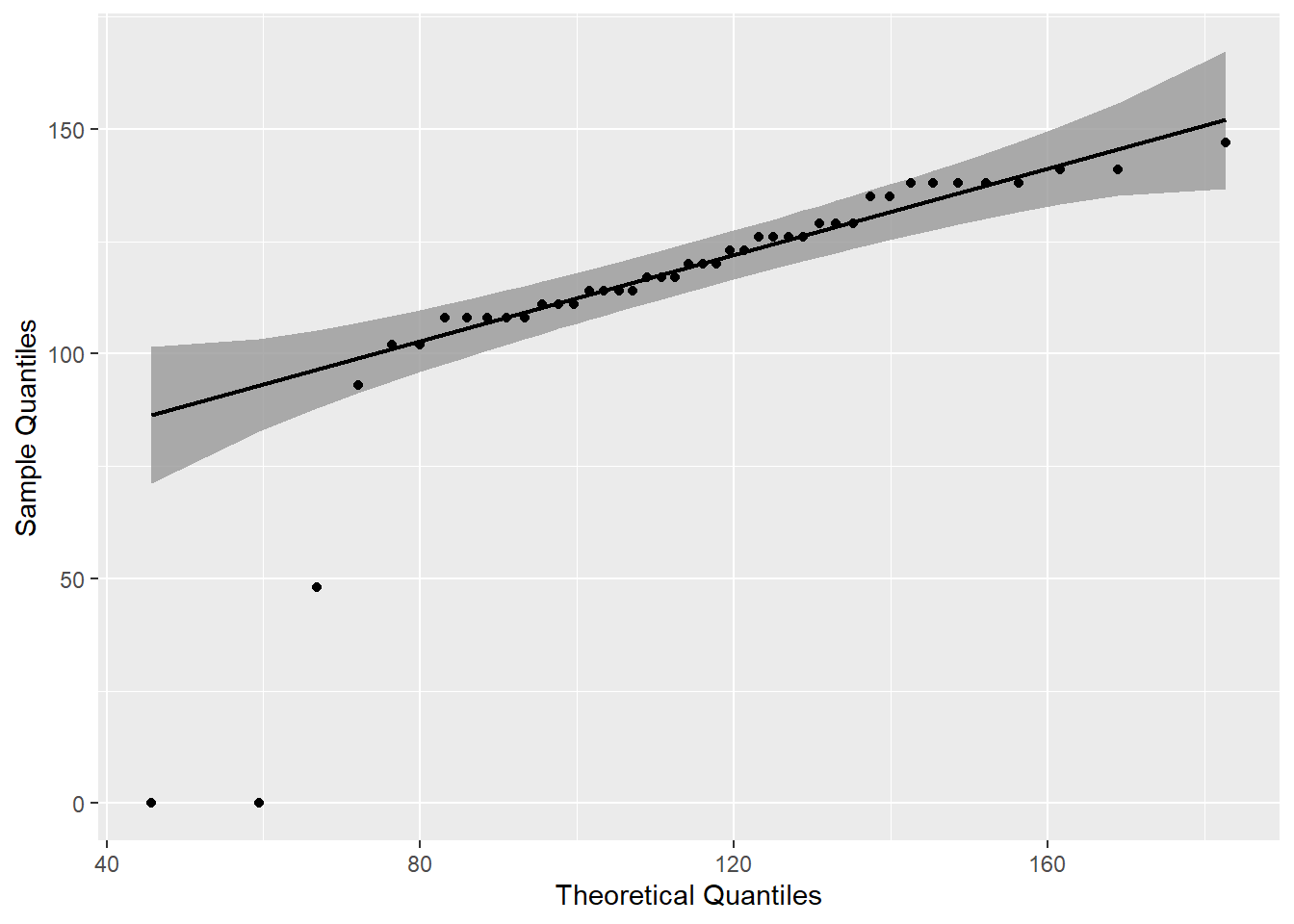
The identify_outliers() function confirms visual interpretation of the QQ Plot and identifies the outliers as extreme.
gb %>%
filter(assignment_name=="Exam2") %>%
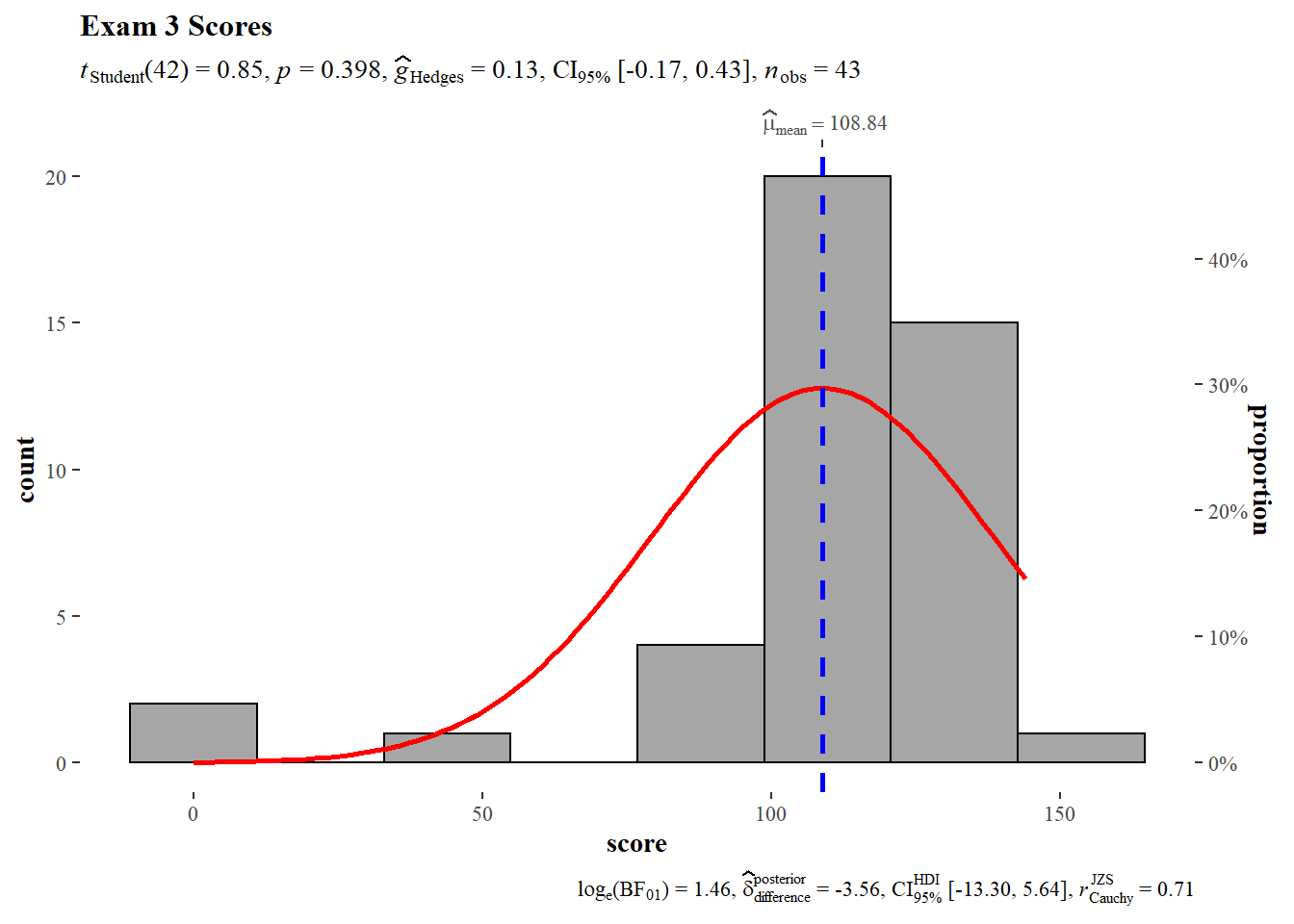
identify_outliers(score)5.3 Exam 3
The null hypothesis cannot be rejected, the sample mean does not deviate significantly from the theoretical mean.
# Exam 3
gb %>%
  filter(., assignment_name == "Exam3") %>%
  gghistostats(data = .,
             x = score,
             test.value = 105,
             normal.curve = TRUE,
             normal.curve.args = list(color = "red", size = 1),
             ggtheme = ggthemes::theme_tufte(),
             title = "Exam 3 Scores"
             )
gb %>%
  filter(assignment_name=="Exam3") %>%
  shapiro_test(score)%>%
  mutate(statistic=round(statistic,3)) %>%
  mutate(p=round(p,3))
gb %>%
filter(assignment_name=="Exam3") %>%
ggplot(.,aes(sample = score))+
stat_qq_band() +
stat_qq_line() +
stat_qq_point() +
labs(x = "Theoretical Quantiles", y = "Sample Quantiles")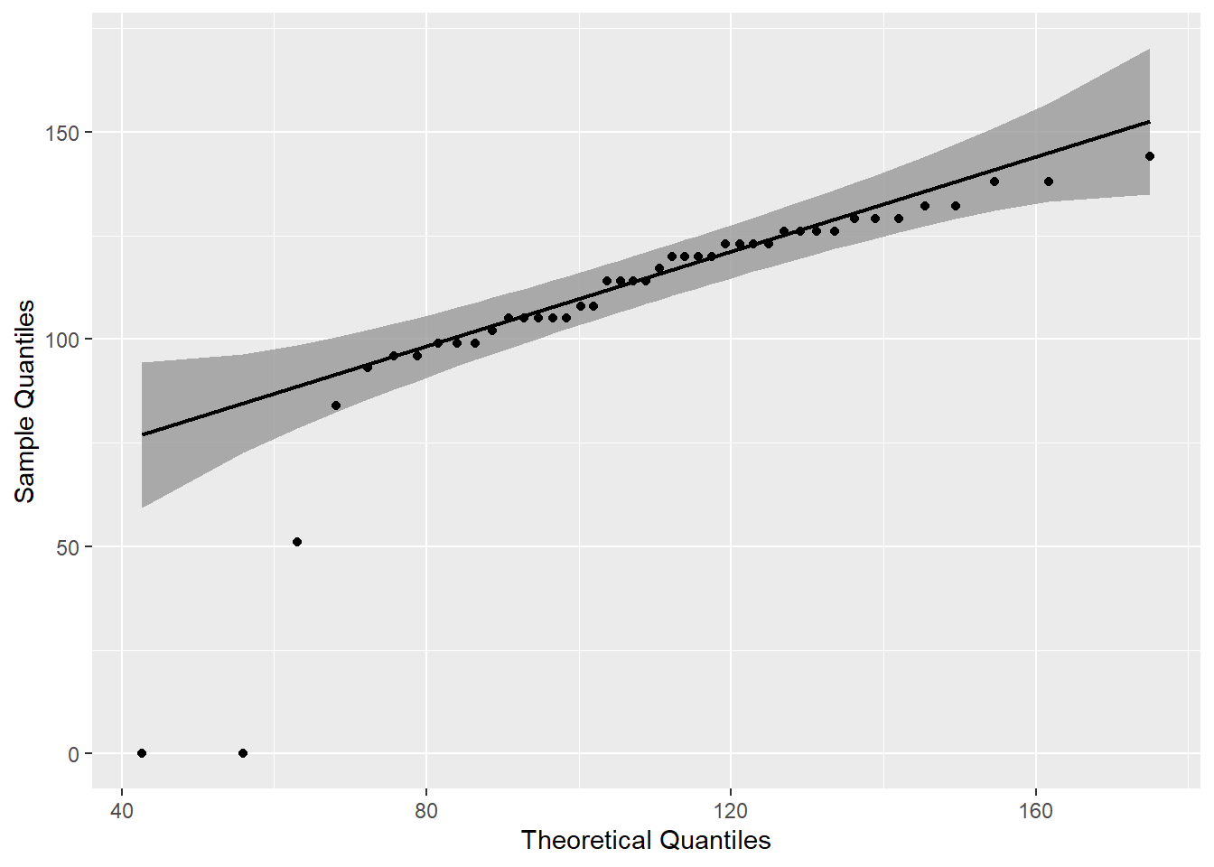
gb %>%
filter(assignment_name=="Exam3") %>%
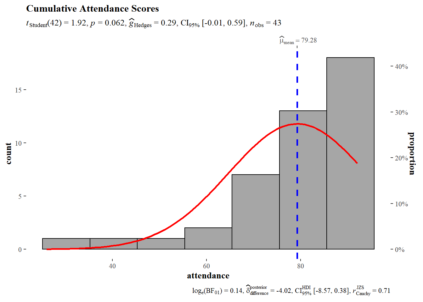
identify_outliers(score)5.4 Attendance
The histogram of attendance is consistent with the summary statistics which suggested a negative skewed distribution. The test value for the one sample t-test was 75 (100 points possible * 0.75 = 75). The null hypothesis cannot be rejected, the sample mean does not deviate significantly from the theoretical mean. Hedges G does not identify any significant size effects.
# Attendance
gb_wide %>%
  gghistostats(data = .,
             x = attendance,
             test.value = 75,
             normal.curve = TRUE,
             normal.curve.args = list(color = "red", size = 1),
             ggtheme = ggthemes::theme_tufte(),
             title = "Cumulative Attendance Scores"
             )
Shapiro-Wilk null hypothesis is rejected, Attendance scores are significantly different than a normal distribution.
gb_wide %>%
  shapiro_test(attendance)%>%
  mutate(statistic=round(statistic,3)) %>%
  mutate(p=round(p,3))
Visual inspection of a QQ Plot indicates the presence of four outliers. Three are on the left side of the distribution and one to the right.
gb_wide %>%
  ggplot(.,aes(sample = attendance))+
  stat_qq_band() +
  stat_qq_line() +
  stat_qq_point() +
  labs(x = "Theoretical Quantiles", y = "Sample Quantiles")
The identify_outliers() function only flaggs three outliers which are those to the left of the QQ Plot. Only one of the three outliers is identified as extreme.
gb_wide %>%
  select(anon_id, attendance) %>%
  identify_outliers(attendance)
Exam 1 has a single outlier while Exams 2 and 3 had three outliers each as did attendance. Notably, two of the same individuals show up as outliers on both Exams 2 and 3. These might be useful to consider in terms of attendance later on. The one extreme outlier in attendance is also an outlier on Exam 3.
5.5 Compare Exam Scores
The ggstatsplot library also provides a function ggwithinstats() to compare distributions and central tendencies of the three exams. The null hypothesis of Fishers F is not rejected indicating that there is no significant differences in the means of the three exams.
gb %>%
  filter(str_detect(assignment_name, "^Exam")) %>%
  group_by(assignment_name) %>%
  ggstatsplot::ggwithinstats(data = .,
               x = assignment_name,
               y = score
               )
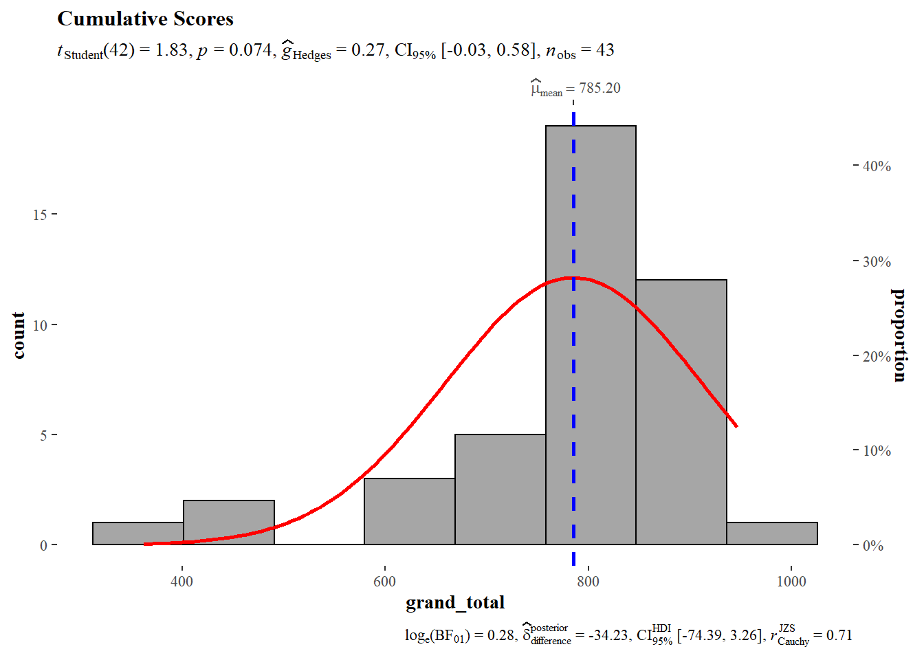
5.6 Grand Total
# Grand Total
gb_wide %>%
  gghistostats(data = .,
             x = grand_total,
             test.value = 750,
             normal.curve = TRUE,
             normal.curve.args = list(color = "red", size = 1),
             ggtheme = ggthemes::theme_tufte(),
             title = "Cumulative Scores"
             )
gb_wide %>%
  shapiro_test(grand_total)%>%
  mutate(statistic=round(statistic,3)) %>%
  mutate(p=round(p,3))
gb_wide %>%
ggplot(.,aes(sample = grand_total))+
stat_qq_band() +
stat_qq_line() +
stat_qq_point() +
labs(x = "Theoretical Quantiles", y = "Sample Quantiles")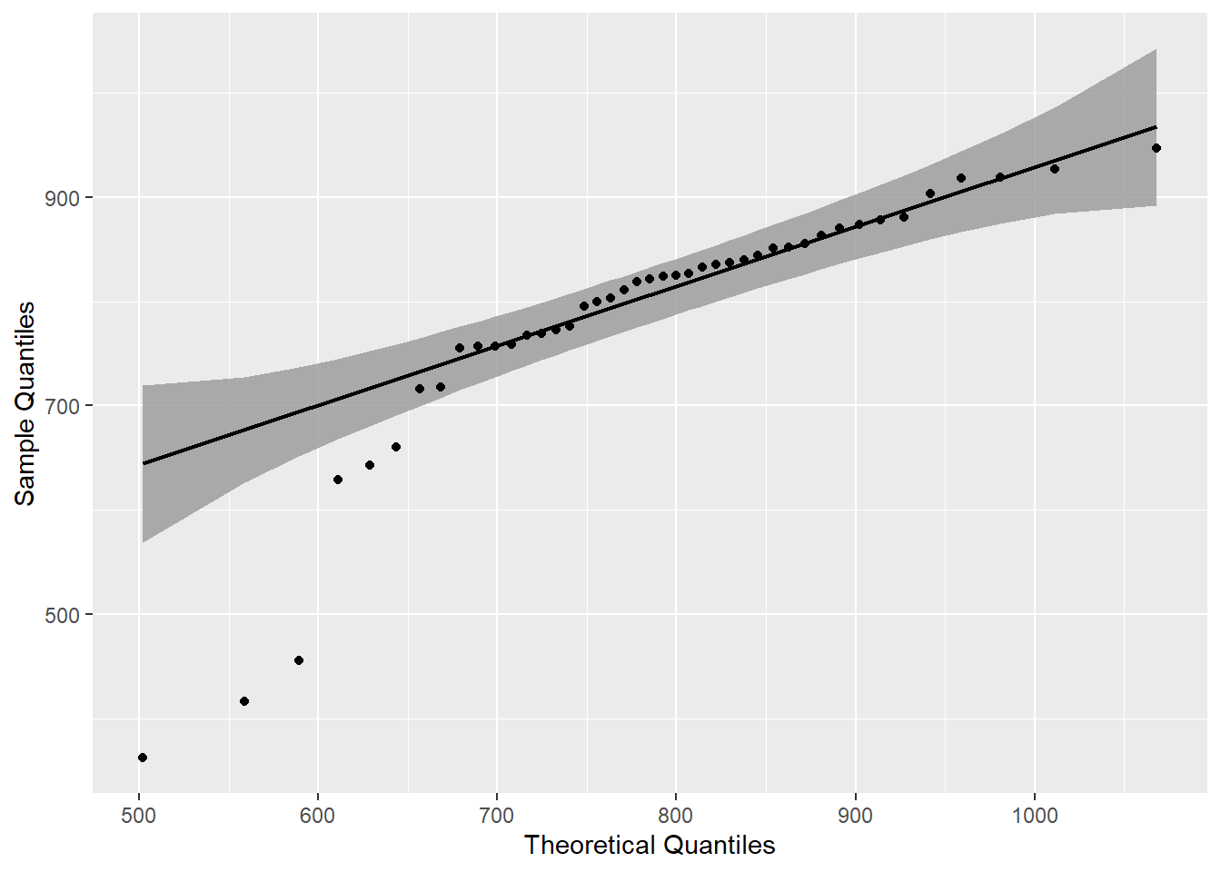
gb_wide %>%
  select(anon_id, grand_total) %>%
  identify_outliers(grand_total)
6 Regression
It would be useful to know if attendance predicts exam performance or if performance on one exam predicts performance on another. Linear regression provides a simple way to examine such relationships.
# gb_wide <- gb %>%
#   filter(str_detect(assignment_name, "^Exam")) %>%
#   pivot_wider(names_from = assignment_name, values_from = score)
6.1 Is Attendance a Predictor of Exam Performance?
At least in this class, Cumulative Attendance explained a statistically not significant and weak proportion of the variance in Exam 1 (\(R^2 = 1.05e-03, F(1, 41) = 0.04, p = 0.837, adj. R^2 = -0.02\)). For Exam 1, attendance was not significant and positive (\(b = 0.04, t(41) = 0.21, p = 0.837\)).
lm(Exam1~attendance, data = gb_wide) %>%
  report()
We fitted a linear model (estimated using OLS) to predict Exam1 with attendance (formula: Exam1 ~ attendance). The model explains a statistically not significant and very weak proportion of variance (R2 = 1.05e-03, F(1, 41) = 0.04, p = 0.837, adj. R2 = -0.02). The model’s intercept, corresponding to attendance = 0, is at 107.15 (95% CI [78.71, 135.59], t(41) = 7.61, p < .001). Within this model:
- The effect of attendance is statistically non-significant and positive (beta = 0.04, 95% CI [-0.32, 0.39], t(41) = 0.21, p = 0.837; Std. beta = 0.03, 95% CI [-0.28, 0.35])
Standardized parameters were obtained by fitting the model on a standardized version of the dataset.
gb_wide %>%
  ggplot(., aes(attendance, Exam1))+
  geom_point()+
  geom_smooth(method = "lm")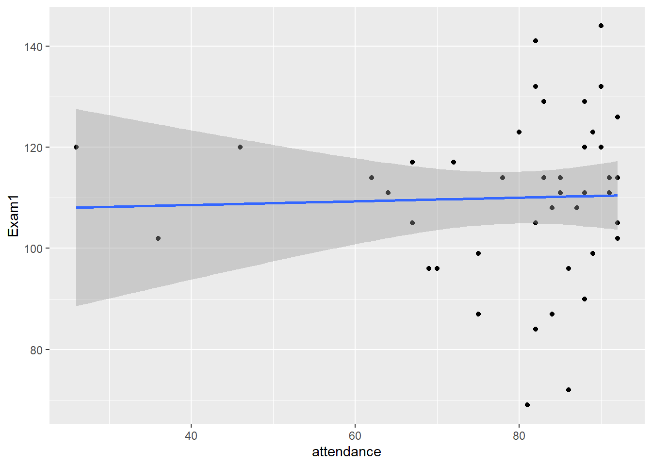
Cumulative Attendance explained a statistically not significant and weak proportion of the variance in Exam 2 (\(R^2 = 0.08, F(1, 41) = 3.41, p = 0.072, adj. R^2 = 0.05\)). The effect of Cumulative Attendance is statistically non-significant and positive (\(b = 0.58, t(41) = 1.85, p = 0.072\)).
lm(Exam2~attendance, data = gb_wide) %>%
  report()
We fitted a linear model (estimated using OLS) to predict Exam2 with attendance (formula: Exam2 ~ attendance). The model explains a statistically not significant and weak proportion of variance (R2 = 0.08, F(1, 41) = 3.41, p = 0.072, adj. R2 = 0.05). The model’s intercept, corresponding to attendance = 0, is at 68.41 (95% CI [17.53, 119.30], t(41) = 2.72, p < .01). Within this model:
- The effect of attendance is statistically non-significant and positive (beta = 0.58, 95% CI [-0.05, 1.21], t(41) = 1.85, p = 0.072; Std. beta = 0.28, 95% CI [-0.03, 0.58])
Standardized parameters were obtained by fitting the model on a standardized version of the dataset.
gb_wide %>%
  ggplot(., aes(attendance, Exam2))+
  geom_point()+
  geom_smooth(method = "lm")
Cumulative Attendance explained a statistically significant and substantial proportion of the variance in Exam 3 (\(R^2 = 0.36, F(1, 41) = 23.00, p < .001, adj. R^2 = 0.34\)). The effect of Cumulative Attendance is statistically significant and positive (\(b = 1.21, t(41) = 4.80, p < .001\)).
lm(Exam3~attendance, data = gb_wide) %>%
  report()
We fitted a linear model (estimated using OLS) to predict Exam3 with attendance (formula: Exam3 ~ attendance). The model explains a statistically significant and substantial proportion of variance (R2 = 0.36, F(1, 41) = 23.00, p < .001, adj. R2 = 0.34). The model’s intercept, corresponding to attendance = 0, is at 13.18 (95% CI [-27.77, 54.12], t(41) = 0.65, p = 0.519). Within this model:
- The effect of attendance is statistically significant and positive (beta = 1.21, 95% CI [0.70, 1.71], t(41) = 4.80, p < .001; Std. beta = 0.60, 95% CI [0.35, 0.85])
Standardized parameters were obtained by fitting the model on a standardized version of the dataset.
gb_wide %>%
  ggplot(., aes(attendance, Exam3))+
  geom_point()+
  geom_smooth(method = "lm")
Cumulative Attendance explained a statistically significant and substantial proportion of the variance in Grand Total(\(R^2 = 0.47, p < .001, adj. R^2 = 0.46\)). The effect of Cumulative Attendance is statistically significant and positive (\(b = 5.91, t(41) = 6.05, p < .001\)).
lm(grand_total~attendance, data = gb_wide) %>%
  report()
We fitted a linear model (estimated using OLS) to predict grand_total with attendance (formula: grand_total ~ attendance). The model explains a statistically significant and substantial proportion of variance (R2 = 0.47, F(1, 41) = 36.55, p < .001, adj. R2 = 0.46). The model’s intercept, corresponding to attendance = 0, is at 316.50 (95% CI [157.34, 475.67], t(41) = 4.02, p < .001). Within this model:
- The effect of attendance is statistically significant and positive (beta = 5.91, 95% CI [3.94, 7.89], t(41) = 6.05, p < .001; Std. beta = 0.69, 95% CI [0.46, 0.92])
Standardized parameters were obtained by fitting the model on a standardized version of the dataset.
gb_wide %>%
  ggplot(., aes(attendance, grand_total))+
  geom_point()+
  geom_smooth(method = "lm")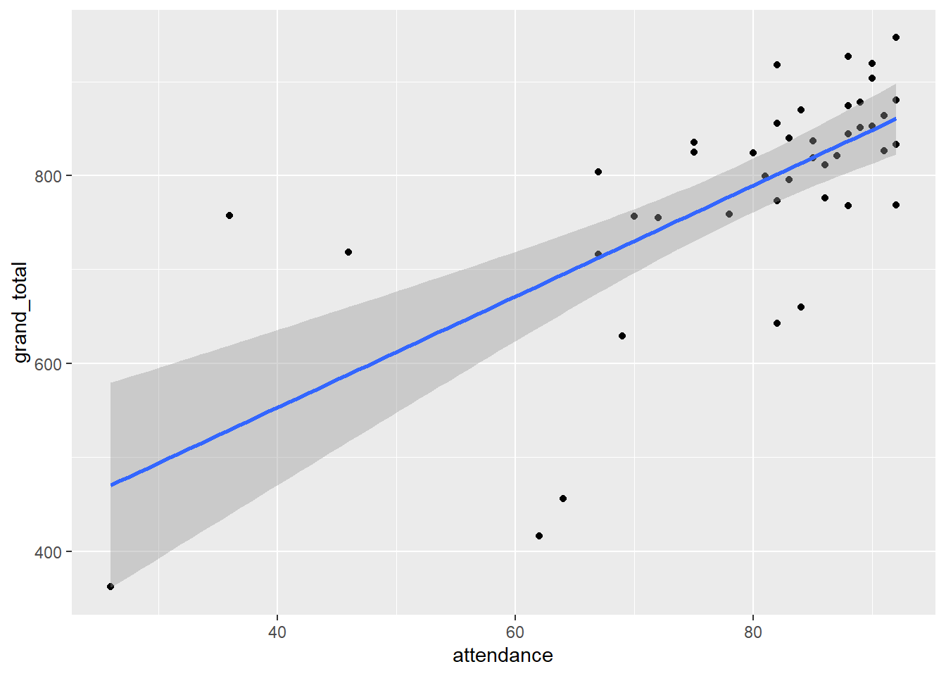
The effect of Cumulative Attendance increased with each exam and was significant on the final. Cumulative Attendance was significant and explained a substantial proportion of variance in Grand Total.
6.2 Does Performance on One Exam Predict Performance on Another?
Exam 1 explains a statistically significant and weak proportion of the variance (\(R^2 = 0.09, F(1, 41) = 4.12, p = 0.049, adj. R^2 = 0.07\)). The effect of Exam 1 on Exam 2 is statistically significant and positive (\(b = 0.56, 95% CI [2.76e-03, 1.12], t(41) = 2.03, p < .05\)).
lm(Exam2~Exam1, data = gb_wide) %>%
  report()
We fitted a linear model (estimated using OLS) to predict Exam2 with Exam1 (formula: Exam2 ~ Exam1). The model explains a statistically significant and weak proportion of variance (R2 = 0.09, F(1, 41) = 4.12, p = 0.049, adj. R2 = 0.07). The model’s intercept, corresponding to Exam1 = 0, is at 52.34 (95% CI [-9.89, 114.57], t(41) = 1.70, p = 0.097). Within this model:
- The effect of Exam1 is statistically significant and positive (beta = 0.56, 95% CI [2.76e-03, 1.12], t(41) = 2.03, p < .05; Std. beta = 0.30, 95% CI [1.48e-03, 0.60])
Standardized parameters were obtained by fitting the model on a standardized version of the dataset.
gb_wide %>%
  ggplot(., aes(Exam1, Exam2))+
  geom_point(aes(color = attendance))+
  geom_smooth(method = "lm")+
  scale_color_gradient(low="red", high="green")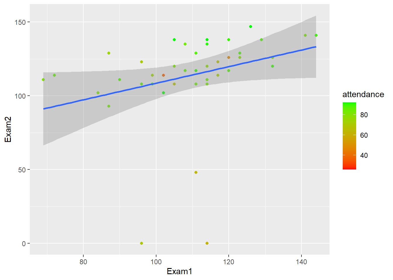
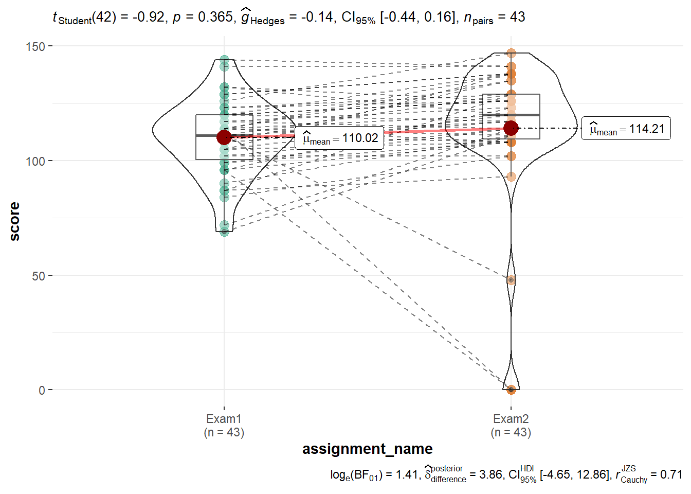
One can use ggstatsplot::ggwithinstats() to see how individual performance changed between Exams 1 and 2. In this case, one can see that the spread of Exam 2 is much wider. This is largely because three individuals who scored below the mean on Exam 1 either got zeros on Exam 2 or generally scored lower than the group as a whole.
gb %>%
  filter(assignment_name == "Exam1" | assignment_name == "Exam2") %>%
    ggstatsplot::ggwithinstats(data = .,
               x = assignment_name,
               y = score
               )
Exam 2 explains a statistically significant and moderate proportion of the variance (\(R^2 = 0.24, F(1, 41) = 12.60, p < .001, adj. R^2 = 0.22\)). The effect of Exam 2 on Exam 3 performance is statistically significant and positive (\(b = 0.47, 95% CI [0.20, 0.73], t(41) = 3.55, p < .001\)).
lm(Exam3~Exam2, data = gb_wide) %>%
  report()
We fitted a linear model (estimated using OLS) to predict Exam3 with Exam2 (formula: Exam3 ~ Exam2). The model explains a statistically significant and moderate proportion of variance (R2 = 0.24, F(1, 41) = 12.60, p < .001, adj. R2 = 0.22). The model’s intercept, corresponding to Exam2 = 0, is at 55.34 (95% CI [23.86, 86.81], t(41) = 3.55, p < .001). Within this model:
- The effect of Exam2 is statistically significant and positive (beta = 0.47, 95% CI [0.20, 0.73], t(41) = 3.55, p < .001; Std. beta = 0.48, 95% CI [0.21, 0.76])
Standardized parameters were obtained by fitting the model on a standardized version of the dataset.
gb_wide %>%
  ggplot(., aes(Exam2, Exam3))+
  geom_point(aes(color = attendance))+
  geom_smooth(method = "lm")+
  scale_color_gradient(low="red", high="green")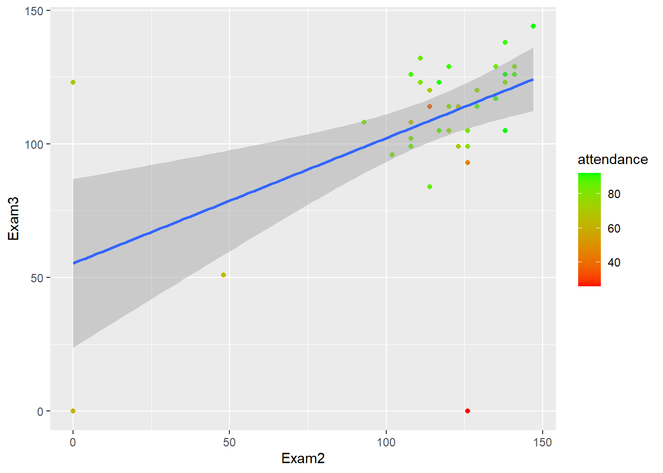
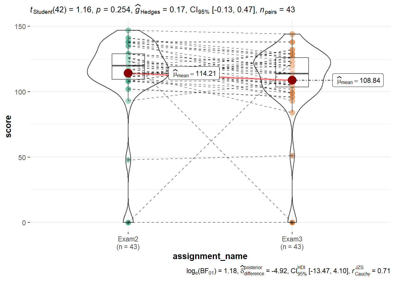
The ggstatsplot::ggwithinstats() violin-box plot shows that Exams 2 and 3 have very similar distributions. This is because in each case there is an individual who scored a zero and one additional individual is scoring lower than the group as a whole.
gb %>%
  filter(assignment_name == "Exam2" | assignment_name == "Exam3") %>%
    ggstatsplot::ggwithinstats(data = .,
               x = assignment_name,
               y = score
               )
Together Exams 1 and 2 explain a statistically significant and moderate proportion of the variance in Exam 3 (\(R^2 = 0.24, F(2, 40) = 6.35, p = 0.004, adj. R^2 = 0.20\)). The effect of Exam 1 is statistically non-significant and negative (\(b = -0.14, 95% CI [-0.67, 0.38], t(40) = -0.55, p = 0.584\)), and the effect of Exam 2 is statistically significant and positive (\(b = 0.49, 95% CI [0.21, 0.77], t(40) = 3.52, p < .01; Std. beta = 0.51\)).
lm(Exam3~Exam1+Exam2, data = gb_wide) %>%
  report()
We fitted a linear model (estimated using OLS) to predict Exam3 with Exam1 and Exam2 (formula: Exam3 ~ Exam1 + Exam2). The model explains a statistically significant and moderate proportion of variance (R2 = 0.24, F(2, 40) = 6.35, p = 0.004, adj. R2 = 0.20). The model’s intercept, corresponding to Exam1 = 0 and Exam2 = 0, is at 68.47 (95% CI [10.87, 126.07], t(40) = 2.40, p < .05). Within this model:
- The effect of Exam1 is statistically non-significant and negative (beta = -0.14, 95% CI [-0.67, 0.38], t(40) = -0.55, p = 0.584; Std. beta = -0.08, 95% CI [-0.37, 0.21])
- The effect of Exam2 is statistically significant and positive (beta = 0.49, 95% CI [0.21, 0.77], t(40) = 3.52, p < .01; Std. beta = 0.51, 95% CI [0.22, 0.80])
Standardized parameters were obtained by fitting the model on a standardized version of the dataset.
Exams 1-3 explain a statistically significant and substantial proportion of variance in the Grand Total (\(R^2 = 0.82, p < .001, adj. R^2 = 0.81\)). The effect of Exam 1 is statistically non-significant and positive (\(b = 0.10, t(39) = 0.19, p = 0.851\)). The effect of Exam 2 is statistically significant and positive (\(b = 1.33, t(39) = 3.95, p < .001\)). The effect of Exam 3 is statistically significant and positive (\(b = 3.01, t(39) = 9.04, p < .001\)).
lm(grand_total~Exam1+Exam2+Exam3, data = gb_wide) %>%
  report()
We fitted a linear model (estimated using OLS) to predict grand_total with Exam1, Exam2 and Exam3 (formula: grand_total ~ Exam1 + Exam2 + Exam3). The model explains a statistically significant and substantial proportion of variance (R2 = 0.82, F(3, 39) = 59.58, p < .001, adj. R2 = 0.81). The model’s intercept, corresponding to Exam1 = 0, Exam2 = 0 and Exam3 = 0, is at 294.66 (95% CI [164.87, 424.45], t(39) = 4.59, p < .001). Within this model:
- The effect of Exam1 is statistically non-significant and positive (beta = 0.10, 95% CI [-1.01, 1.21], t(39) = 0.19, p = 0.851; Std. beta = 0.01, 95% CI [-0.13, 0.16])
- The effect of Exam2 is statistically significant and positive (beta = 1.33, 95% CI [0.65, 2.01], t(39) = 3.95, p < .001; Std. beta = 0.32, 95% CI [0.16, 0.49])
- The effect of Exam3 is statistically significant and positive (beta = 3.01, 95% CI [2.34, 3.68], t(39) = 9.04, p < .001; Std. beta = 0.70, 95% CI [0.55, 0.86])
Standardized parameters were obtained by fitting the model on a standardized version of the dataset.