Canvas Summarize and Explore Grades Across Classes
Nathan Craig
13 May 2021
1 Introduction
This document illustrates some Exploratory Data Analysis (EDA) (Tukey 1977) of Canvas exam grades. The data are wrangled with tidyverse and dplyr (Wickham 2019) functions, then plotted with ggplot2 (Wickham et al. 2020) and ggstatsplot (Patil 2021).
2 Load Libraries
We begin by loading the necessary libraries.
# Read CSV file
library(readr)

# Data wrangling and formatting
library(tidyverse)
library(kableExtra)
library(knitr)
opts_chunk$set(comment=NA,
               prompt=FALSE,
               cache=FALSE,
               echo=TRUE,
               results='asis')

# Stats
library(summarytools)

# Plotting
library(ggplot2)
library(ggstatsplot)
3 Load Data and Wrangle
Since we are working with multiple classes, in this case eight comparable instances, the files werepulled from canvas and then saved to a csv file. Here that file is read from disk and wrangled into shape.
gb_list <- read_csv("data/gb_list.csv")Warning: Missing column names filled in: 'X1' [1]
-- Column specification --------------------------------------------------------
cols(
  X1 = col_double(),
  anon_id = col_character(),
  assignment_name = col_character(),
  score = col_double(),
  course_id = col_double(),
  course_name = col_character()
)
gb_list <- gb_list %>%
mutate(course_id = as_factor(course_id)) %>%
mutate(course_name = as_factor(course_name))The base R factor() function is applied to order the classes chronologically. This ensures proper ordering in the graphs that follow.
# order the factors properly
gb_list$course_name <- factor(gb_list$course_name,
                              levels= c(
                                "ANTH-125G S19",
                                "ANTH-125G F19",
                                "HON-235G F19",
                                "ANTH-125G S20",
                                "ANTH-125G F20",
                                "HON-235G F20",
                                "ANTH-1140G S21",
                                "HNRS-2161G S21"
                              ))
4 Exam 1
library(kableExtra)gb_list %>%
filter(str_detect(assignment_name, "^Exam1|^EXAM1")) %>%
group_by(course_name) %>%
select(assignment_name, score, course_name) %>%
descr(stats = c("mean", "sd", "min", "med", "max", "skewness", "kurtosis"),
transpose = TRUE,
headings = FALSE
) %>%
tb() %>%
kable(format = "html", digits = 2) %>%
kable_styling(bootstrap_options = "striped")| course_name | variable | mean | sd | min | med | max | skewness | kurtosis |
|---|---|---|---|---|---|---|---|---|
| ANTH-125G S19 | score | 75.14 | 16.70 | 0 | 78.0 | 96 | -1.98 | 5.73 |
| ANTH-125G F19 | score | 105.63 | 19.64 | 60 | 108.0 | 144 | -0.38 | -0.45 |
| HON-235G F19 | score | 124.21 | 17.06 | 87 | 127.5 | 144 | -0.53 | -0.89 |
| ANTH-125G S20 | score | 110.02 | 16.40 | 69 | 111.0 | 144 | -0.36 | 0.02 |
| ANTH-125G F20 | score | 114.84 | 19.28 | 66 | 114.0 | 150 | -0.30 | -0.43 |
| HON-235G F20 | score | 134.29 | 11.60 | 99 | 135.0 | 147 | -1.51 | 2.37 |
| ANTH-1140G S21 | score | 117.85 | 19.12 | 66 | 123.0 | 147 | -0.73 | 0.15 |
| HNRS-2161G S21 | score | 126.82 | 12.45 | 111 | 126.0 | 150 | 0.40 | -1.27 |
gb_list %>%
  filter(str_detect(assignment_name, "^Exam1|^EXAM1")) %>%
  group_by(course_name) %>%
ggplot(., aes(x = score))+
  geom_histogram()+
  facet_wrap(~ course_name)+
    labs(
    title = "Exam 1 Histograms Across Classes"
  )
`stat_bin()` using `bins = 30`. Pick better value with `binwidth`.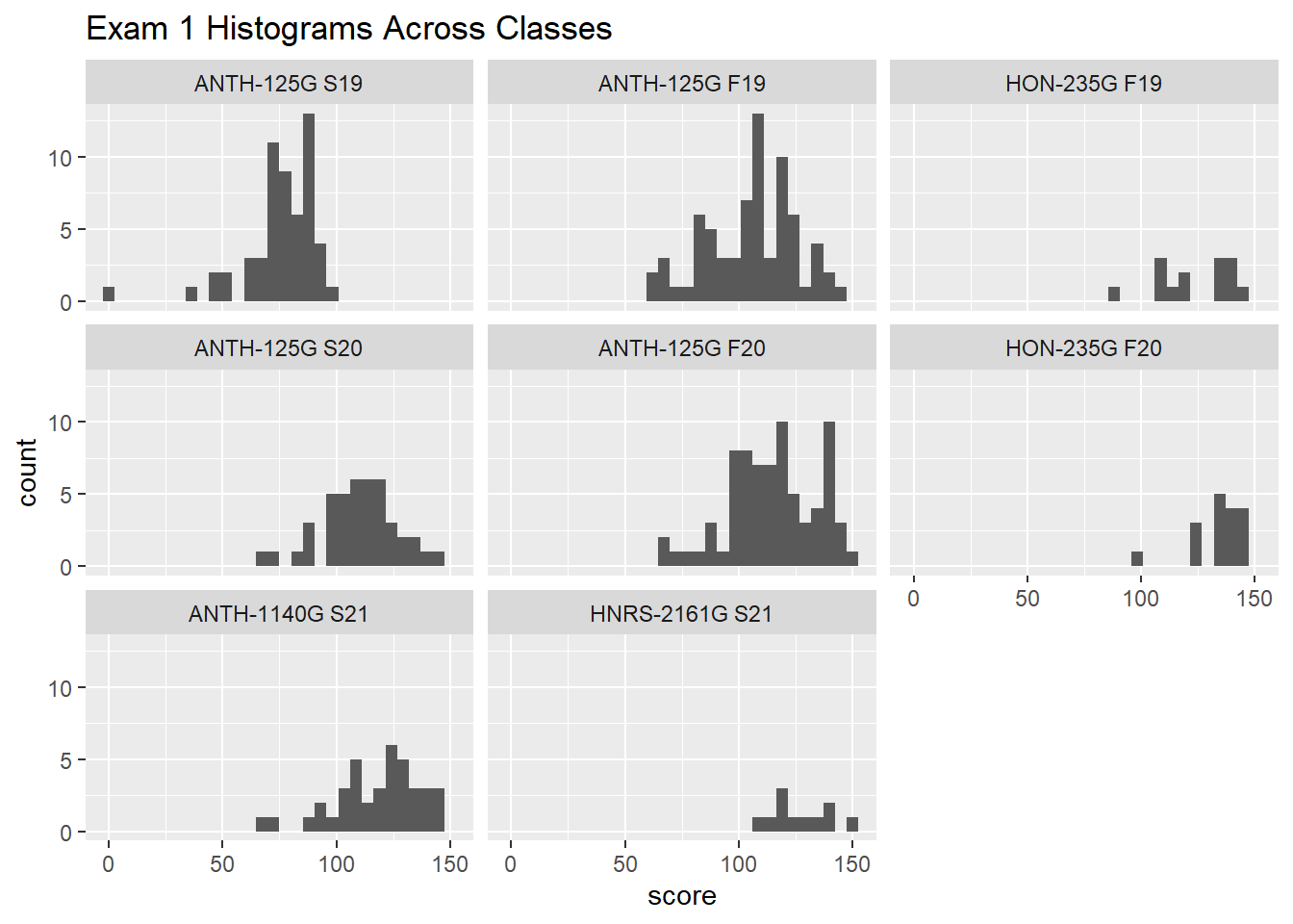
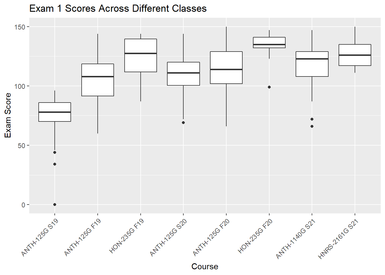
gb_list %>%
  group_by(course_id) %>%
  filter(str_detect(assignment_name, "^Exam1|^EXAM1")) %>%
  ggplot(.,aes(x=course_name, y = score, group=course_name))+
  geom_boxplot()+
  theme(axis.text.x = element_text(angle = 45, hjust = 1))+
    labs(
    title = "Exam 1 Scores Across Different Classes",
    x = "Course",
    y = "Exam Score"
  )
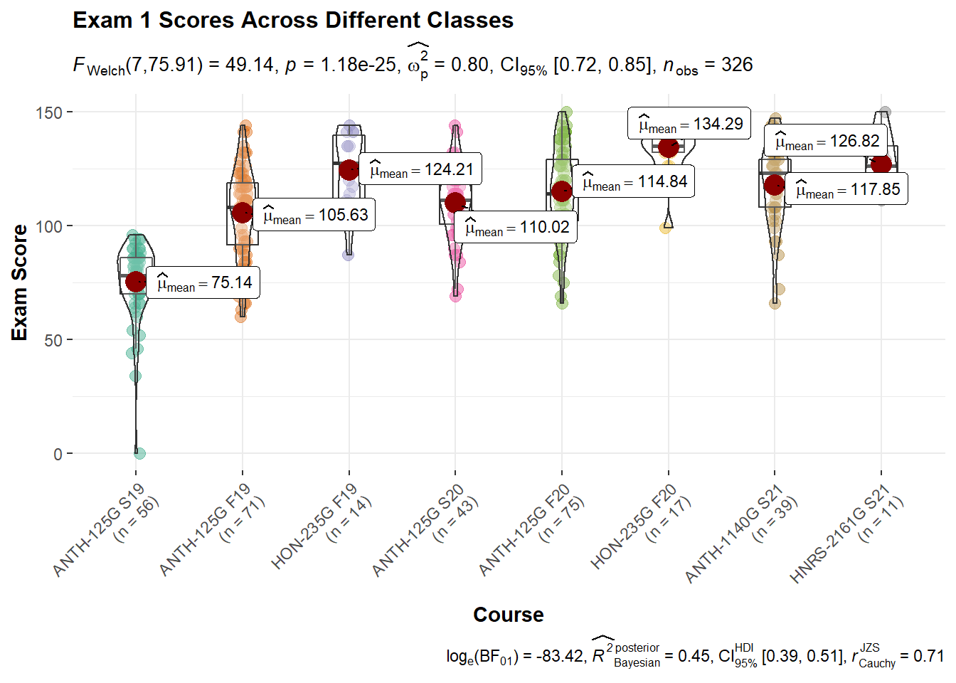
gb_list %>%
  group_by(course_name) %>%
  filter(str_detect(assignment_name, "^Exam1|^EXAM1")) %>%
  ggbetweenstats(
    data = .,
    x = course_name,
    y = score,
    pairwise.comparisons = FALSE)+
  theme(axis.text.x = element_text(angle = 45, hjust = 1))+
    labs(
    title = "Exam 1 Scores Across Different Classes",
    x = "Course",
    y = "Exam Score"
  )
5 Exam 2
gb_list %>%
  filter(str_detect(assignment_name, "^Exam2|^EXAM2")) %>%
  group_by(course_name) %>%
  select(assignment_name, score, course_name) %>%
  descr(stats = c("mean", "sd", "min", "med", "max", "skewness", "kurtosis"),
        transpose = TRUE,
        headings = FALSE) %>%
  tb() %>%
  kable(format = "html", digits = 2) %>%
kable_styling(bootstrap_options = "striped")| course_name | variable | mean | sd | min | med | max | skewness | kurtosis |
|---|---|---|---|---|---|---|---|---|
| ANTH-125G S19 | score | 69.57 | 20.36 | 0 | 75 | 94 | -2.09 | 4.59 |
| ANTH-125G F19 | score | 101.49 | 24.48 | 0 | 105 | 141 | -1.84 | 6.01 |
| HON-235G F19 | score | 126.64 | 12.74 | 99 | 126 | 141 | -0.49 | -0.81 |
| ANTH-125G S20 | score | 114.21 | 30.53 | 0 | 120 | 147 | -2.54 | 6.75 |
| ANTH-125G F20 | score | 115.08 | 18.75 | 51 | 117 | 141 | -0.84 | 0.58 |
| HON-235G F20 | score | 123.53 | 33.31 | 0 | 126 | 147 | -2.93 | 8.17 |
| ANTH-1140G S21 | score | 113.54 | 13.95 | 78 | 117 | 138 | -0.47 | -0.39 |
| HNRS-2161G S21 | score | 119.18 | 9.59 | 108 | 120 | 141 | 0.78 | -0.13 |
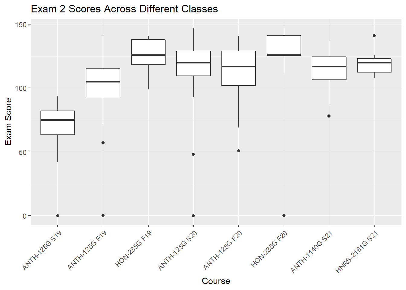
gb_list %>%
  filter(str_detect(assignment_name, "^Exam2|^EXAM2")) %>%
  group_by(course_name) %>%
ggplot(., aes(x = score))+
  geom_histogram()+
  facet_wrap(~ course_name)+
  labs(
    title = "Exam 2 Histograms Across Classes"
  )
`stat_bin()` using `bins = 30`. Pick better value with `binwidth`.
gb_list %>%
  group_by(course_id) %>%
  filter(str_detect(assignment_name, "^Exam2|^EXAM2")) %>%
  ggplot(.,aes(x=course_name, y = score, group=course_name))+
  geom_boxplot()+
  theme(axis.text.x = element_text(angle = 45, hjust = 1))+
  labs(
    title = "Exam 2 Scores Across Different Classes",
    x = "Course",
    y = "Exam Score"
  )
gb_list %>%
  group_by(course_name) %>%
  filter(str_detect(assignment_name, "^Exam2|^EXAM2")) %>%
  ggbetweenstats(
    data = .,
    x = course_id,
    y = score,
    pairwise.comparisons = FALSE)+
  theme(axis.text.x = element_text(angle = 45, hjust = 1))+
    labs(
    title = "Exam 2 Scores Across Different Classes",
    x = "Course",
    y = "Exam Score"
  )
Adding missing grouping variables: `course_name`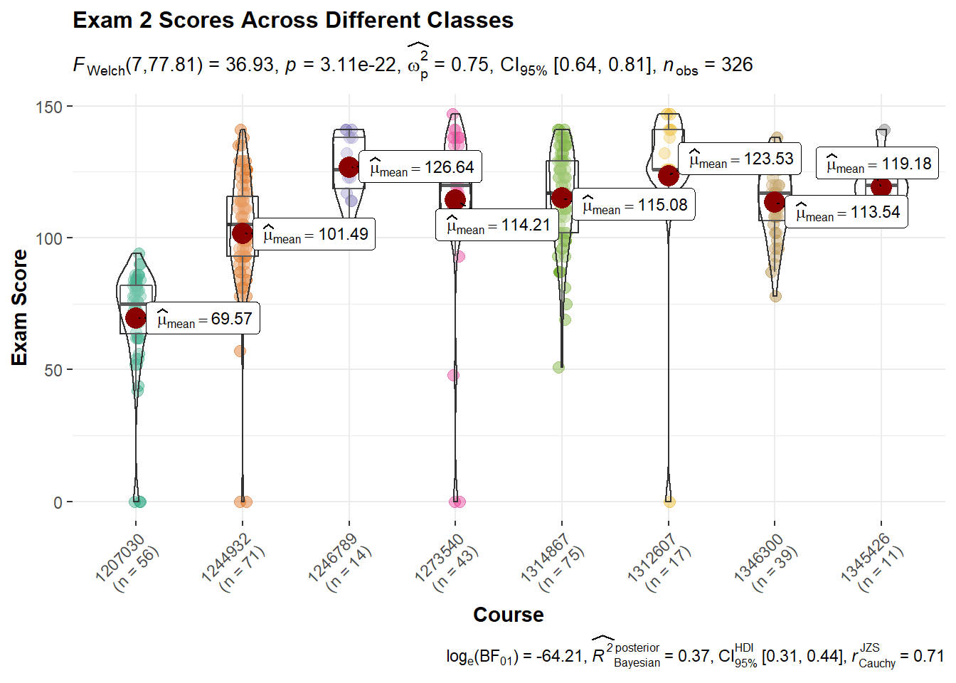
6 Exam 3
gb_list %>%
  filter(str_detect(assignment_name, "^Exam3|^EXAM3")) %>%
  group_by(course_name) %>%
  select(assignment_name, score, course_name) %>%
  descr(stats = c("mean", "sd", "min", "med", "max", "skewness", "kurtosis"),
        transpose = TRUE,
        headings = FALSE) %>%
  tb() %>%
  kable(format = "html", digits = 2) %>%
kable_styling(bootstrap_options = "striped")| course_name | variable | mean | sd | min | med | max | skewness | kurtosis |
|---|---|---|---|---|---|---|---|---|
| ANTH-125G S20 | score | 108.84 | 29.49 | 0 | 114 | 144 | -2.37 | 6.13 |
| ANTH-125G F20 | score | 144.72 | 41.58 | 0 | 156 | 195 | -2.13 | 5.11 |
| HON-235G F20 | score | 158.47 | 44.40 | 0 | 171 | 192 | -2.60 | 6.62 |
| ANTH-1140G S21 | score | 133.54 | 56.24 | 0 | 156 | 183 | -1.64 | 1.23 |
| HNRS-2161G S21 | score | 166.91 | 15.72 | 141 | 171 | 192 | -0.34 | -1.14 |
gb_list %>%
  filter(str_detect(assignment_name, "^Exam3|^EXAM3|^Fin|^FIN")) %>%
  group_by(course_name) %>%
ggplot(., aes(x = score))+
  geom_histogram()+
  facet_wrap(~ course_name)+
  labs(
    title = "Exam 3 Histograms Across Classes"
  )
`stat_bin()` using `bins = 30`. Pick better value with `binwidth`.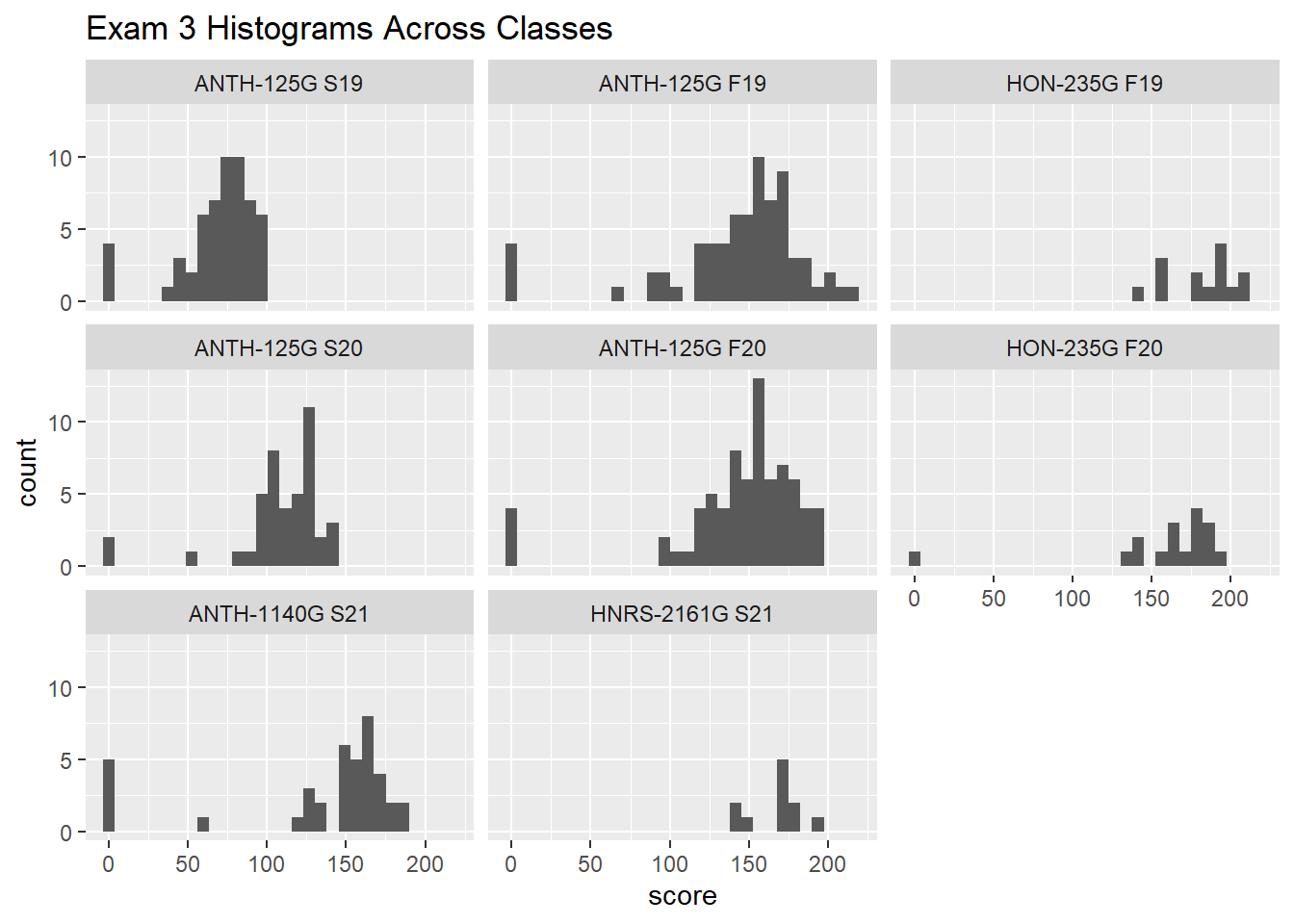
gb_list %>%
  group_by(course_id) %>%
  filter(str_detect(assignment_name, "^Exam3|^EXAM3|^Fin|^FIN")) %>%
  ggplot(.,aes(x=course_name, y = score, group=course_name))+
  geom_boxplot()+
  theme(axis.text.x = element_text(angle = 45, hjust = 1))+
  labs(
    title = "Exam 3 Scores Across Different Classes",
    x = "Course",
    y = "Exam Score"
  )
gb_list %>%
  group_by(course_name) %>%
  filter(str_detect(assignment_name, "^Exam3|^EXAM3|^Fin|^FIN")) %>%
  ggbetweenstats(
    data = .,
    x = course_id,
    y = score,
    pairwise.comparisons = FALSE)+
  theme(axis.text.x = element_text(angle = 45, hjust = 1))+
    labs(
    title = "Exam 3 Scores Across Different Classes",
    x = "Course",
    y = "Exam Score"
  )
Adding missing grouping variables: `course_name`
Patil, Indrajeet. 2021. Ggstatsplot: Ggplot2 Based Plots with Statistical Details. https://CRAN.R-project.org/package=ggstatsplot.
Tukey, John Wilder. 1977. Exploratory Data Analysis. Addison-Wesley Series in Behavioral Science. Reading, Mass: Addison-Wesley Pub. Co.
Wickham, Hadley. 2019. Tidyverse: Easily Install and Load the Tidyverse. https://CRAN.R-project.org/package=tidyverse.
Wickham, Hadley, Winston Chang, Lionel Henry, Thomas Lin Pedersen, Kohske Takahashi, Claus Wilke, Kara Woo, Hiroaki Yutani, and Dewey Dunnington. 2020. Ggplot2: Create Elegant Data Visualisations Using the Grammar of Graphics. https://CRAN.R-project.org/package=ggplot2.